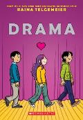
The Color of Drama
I therefore latched onto this passage from Graphic Novel Reporter’s interview with Raina Telgemeier about Drama:
You worked with design studio Gurihiru to create a color scheme for this book that perfectly complements the tone of the story. Tell us a little bit about how you went about that.In the New York Times Book Review, Ada Calhoun praised that element of the art: “Telgemeier’s use of color, created with the design team Gurihiru, is eloquent; Callie’s amethyst-colored hair complements her suburb’s sky-blue skies and pistachio-green grass.”
Gurihiru (a two-women team, Kawano and Sasaki) is responsible for some of my favorite art and comics of the past half-decade or so. They illustrated the rebooted Marvel Power Pack series, and they’re working on the Avatar: The Last Airbender: The Lost Adventures with Gene Yang right now. They have a really soft, pleasing color palette, so I looked to them to help create the jewel-toned world of Callie’s universe, which I love.
In some cases, I had really clear ideas—the story is set in a specific part of California, where the weather and atmosphere are very distinctive. And because Gurihiru are Japanese and work through a translator, there were a few instances where they needed solid American references. Soda cans, the bookstore scene, things like that.

Frankly I don’t see coloring the skies “sky-blue” to be that much of a stretch. But once the interview called it to my attention I could see how Telgemeier and Gurihiru had found a rich, luminous palette even as they stayed away from the stark primaries.
![]()


No comments:
Post a Comment